The Story Behind The "Barriers" Print

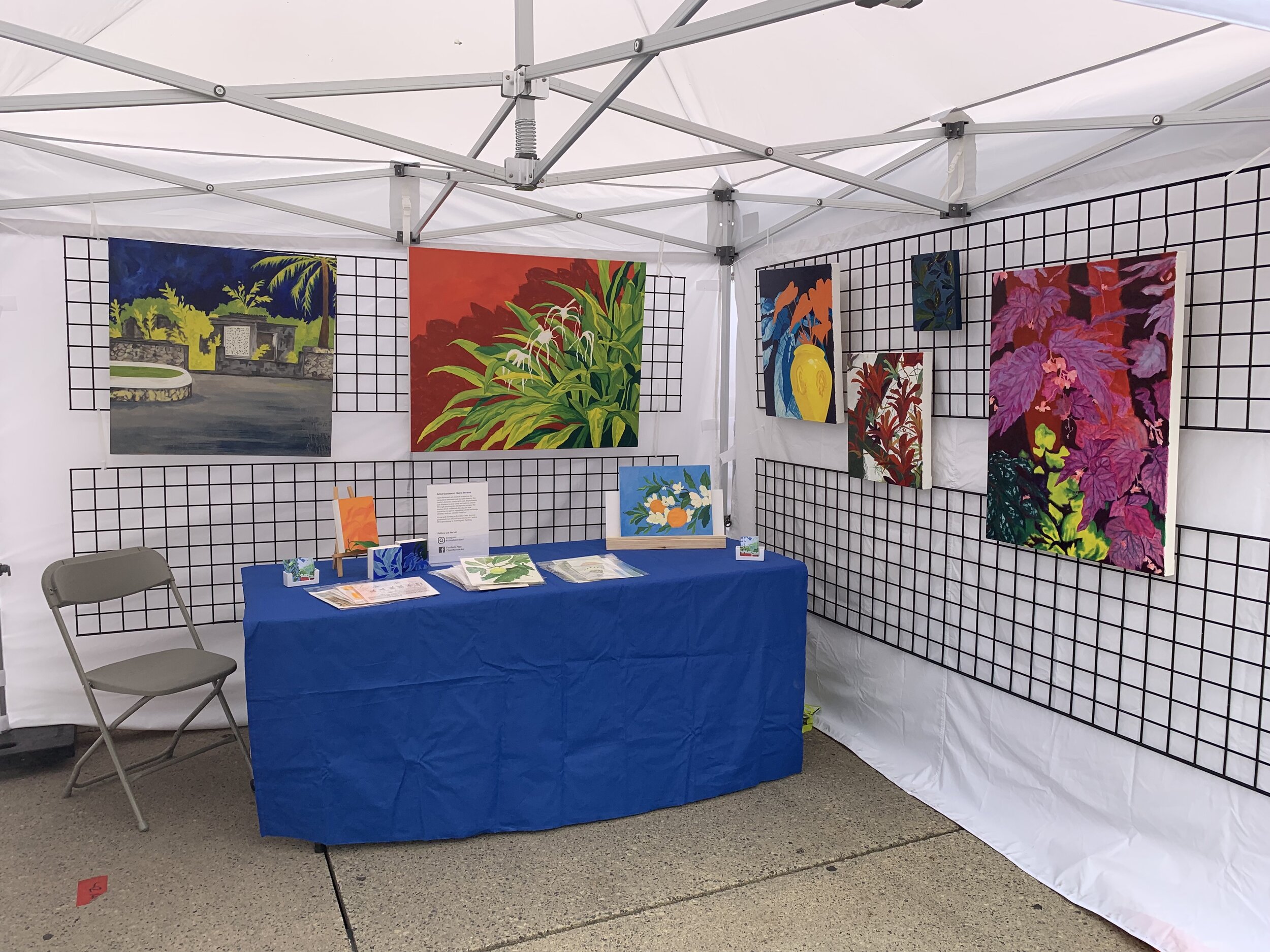
A few years ago I was inspired to work on an image inspired by my experience of barriers. Considering the real world barriers of walls and other physical dividers. My experiences of trying to navigate the unclear terrain of cultural barriers. Plus the unseen obstacles of emotional barriers.

All these ideas were considered when approaching the creation of the “Barriers” linocut prints. Concepts which I drew upon from my own lived experiences.

“Barriers”, linocut print, black ink on paper. Sheet: 6.5 x 9.75 inches; Impression: 4 x 7.25 inches. 2020.

Barriers”, linocut print, black ink on paper. Sheet: 6.5 x 9.75 inches; Impression: 4 x 7.25 inches. 2020.

This piece meant a lot to me when creating. Drawing out the image, carving out the lino block, and printing each edition by hand. It was meditative work. 

Once completed, I was not ready to reveal the work to the public because the feelings that went into the art still felt fresh and vulnerable. 

During the height of anxieties felt by Black people watching as lives were snuffed out and the challenges of Black existence were being made more apparent to others, what should I come across? After years packed away I found these prints and they resonated so deeply that I had to readdress this work. 

So I gave these pieces my attention and care. 

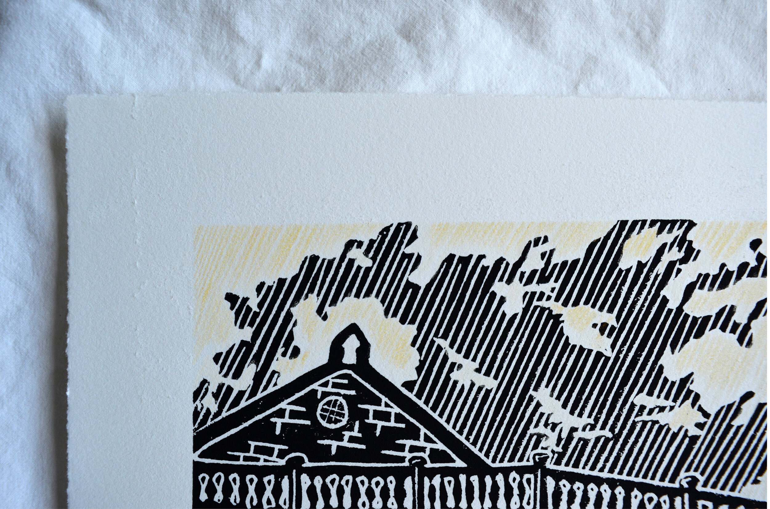
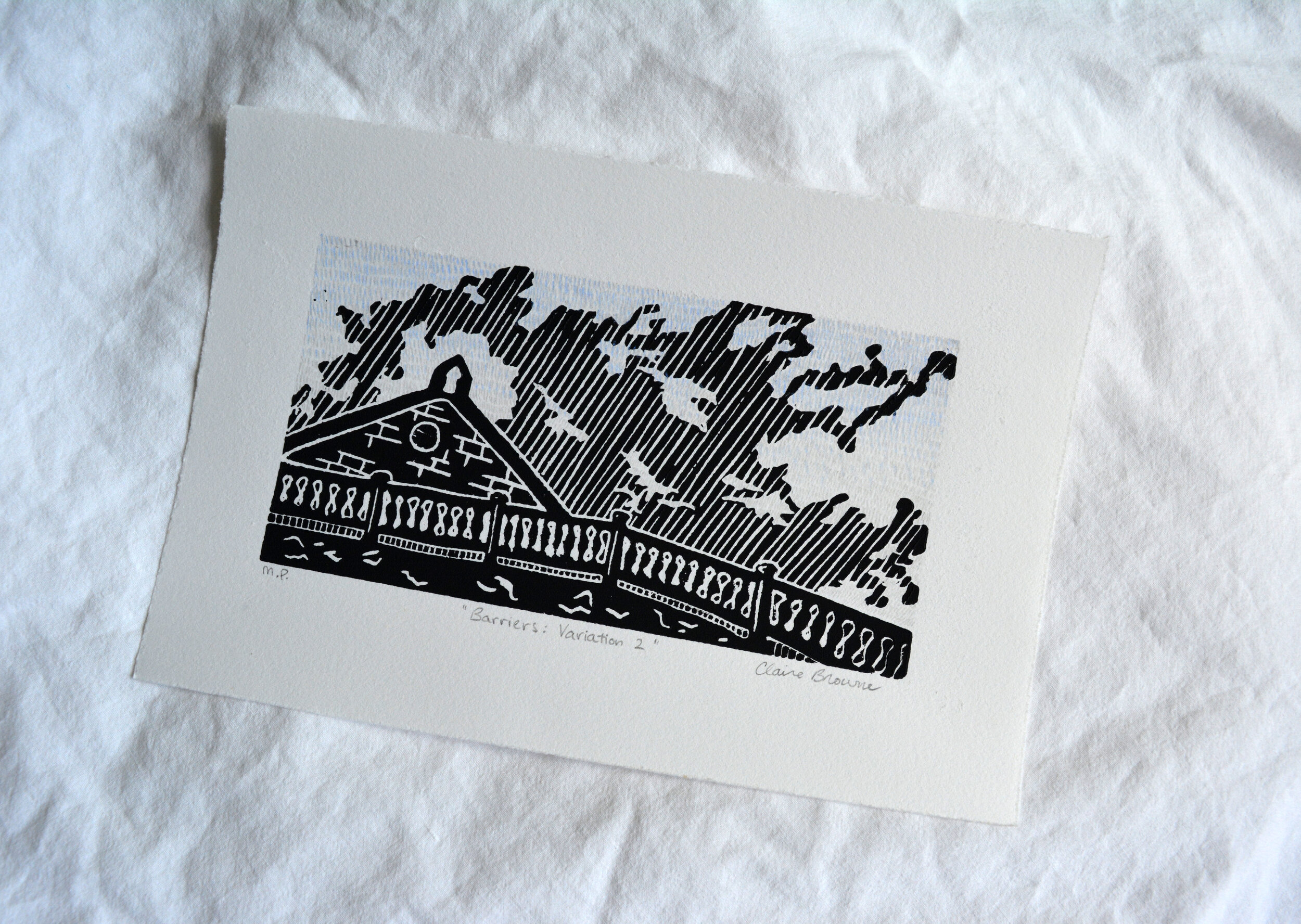
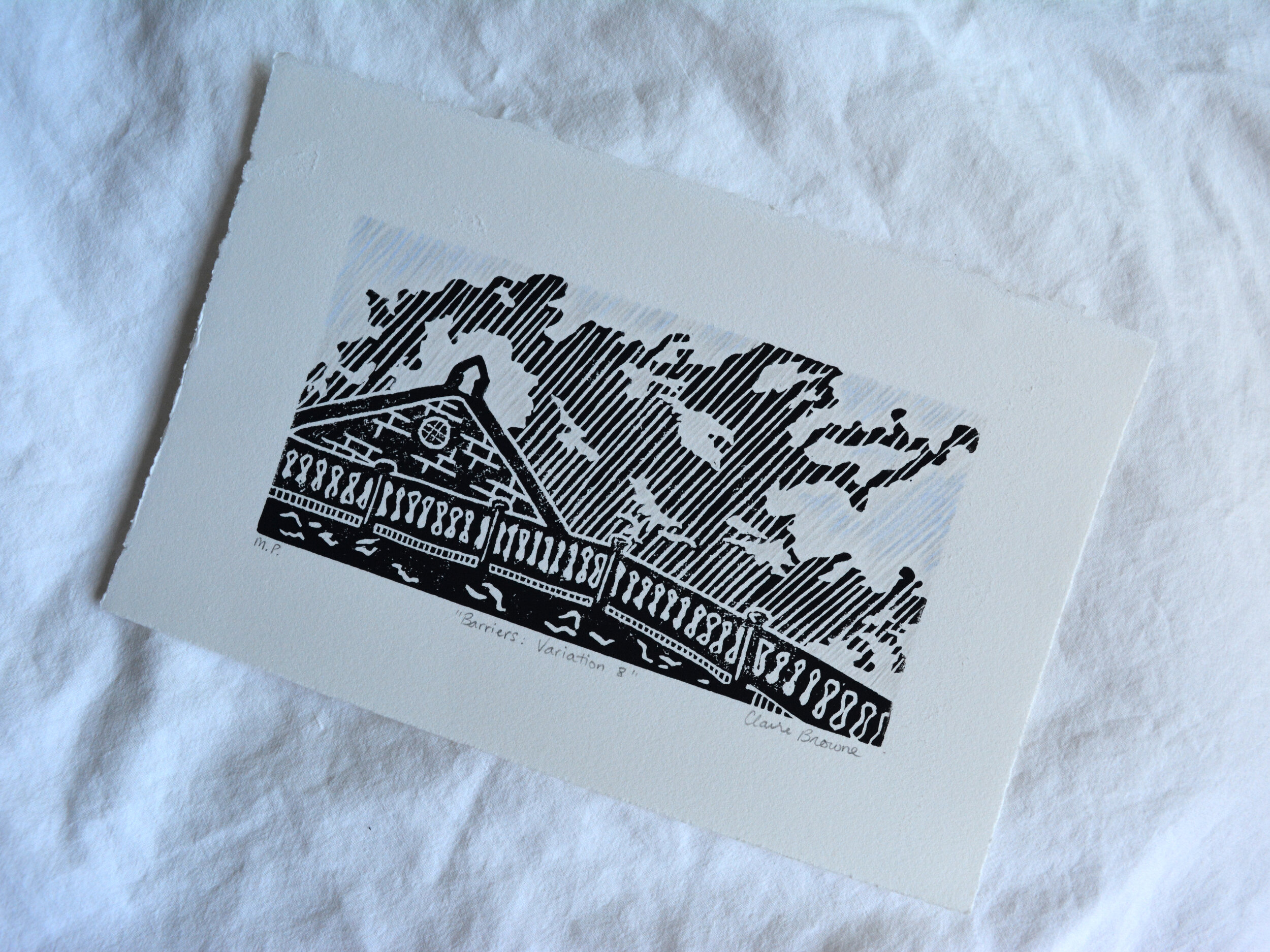
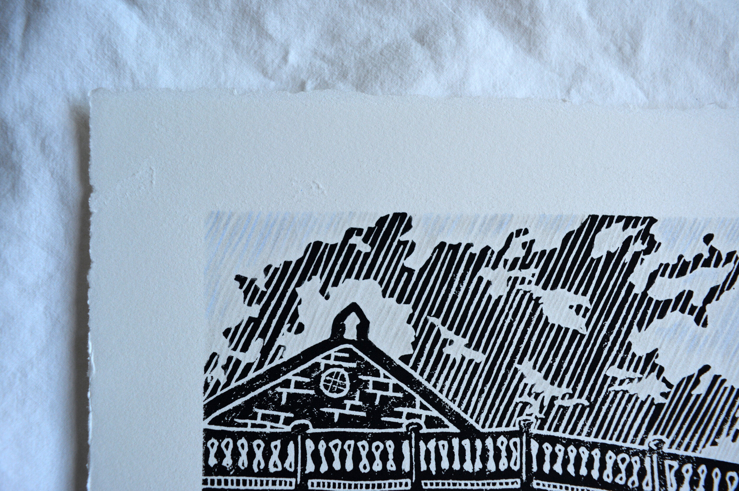
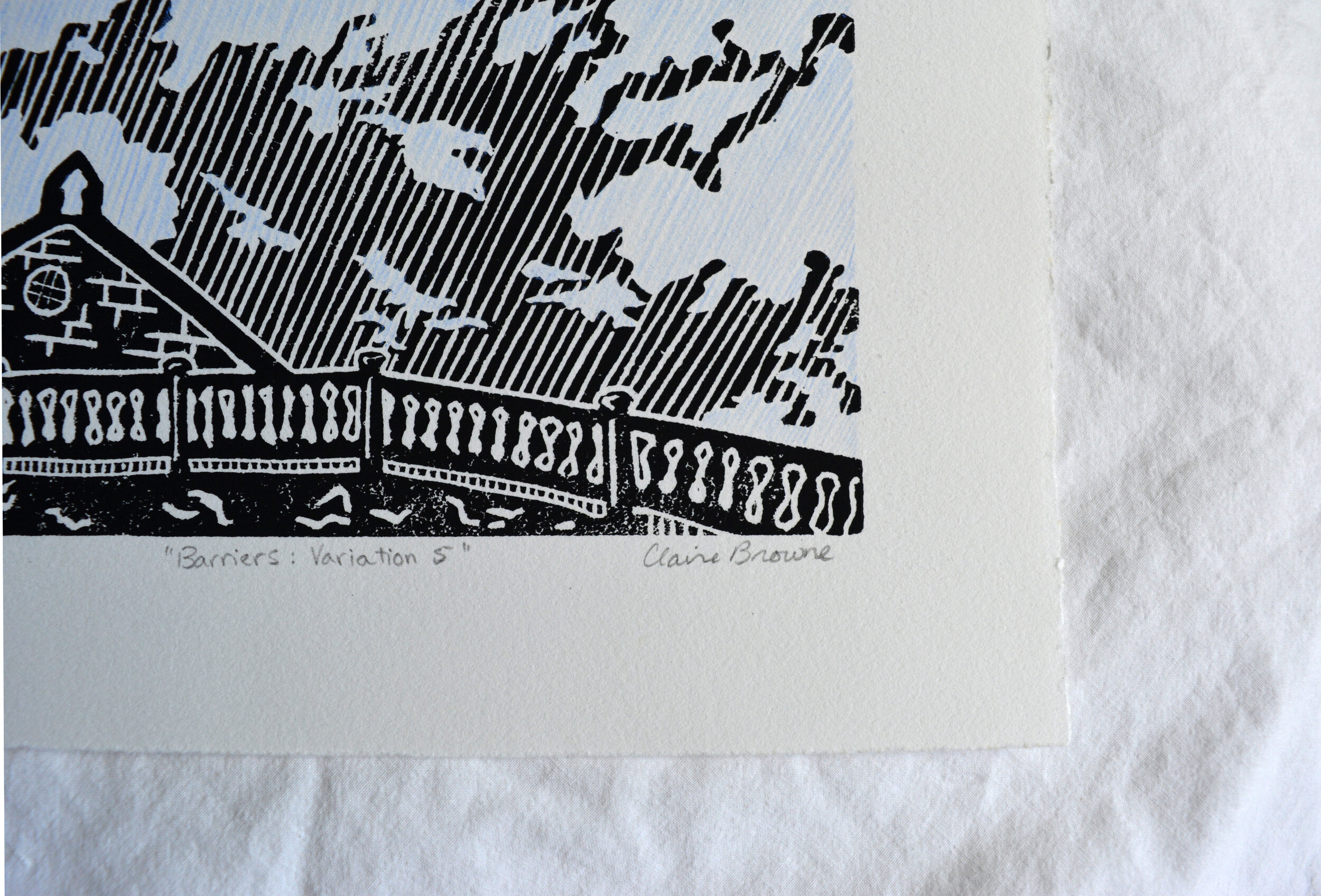
What I created is a limited edition of 8 black ink prints titled “Barriers”.

Plus, 8 mono prints, such as "Barriers: Variation 1". The mono prints were created using the base image of the black ink relief print with a unique hand-applied colour application of colour pencil or watercolour.  

“Barriers: Variation 1”, mono print, black ink and pencil crayon on paper. Sheet: 6.5 x 9.75 inches; Impression 4 x 7.25 inches. 2020.

“Barriers: Variation 1”, mono print, black ink and pencil crayon on paper. Sheet: 6.5 x 9.75 inches; Impression 4 x 7.25 inches. 2020.

Because of the gravity of feeling that went into this artwork and coming back to these prints at such a very important time in the Black Lives Matter movement it feels right to acknowledge that more work needs to be done to remove barriers for Black people. 

For this reason I will be donating 20% from each piece sold to the Toronto-based organization Black Women in Motion. The “Barriers” linocut prints and mono prints will be available for $60 on June 30, 2020 in my shop.

Black Women in Motion is one of the only organizations in Canada that supports and advocates for Black survivors of gender-based violence. They are doing necessary work to provide mental health education, consent education and resources to support Black womxn, femmes and non-binary people. I recommend you read more on their website.

5 Best Art Supplies for Travel or On-the-Go

From a young age I was creative. I would pack a colouring book and crayons in my backpack if going on a trip in the car. Ensuring I had art supplies available was important for me during times of travel. This concept has remained true as I’ve transitioned into the life of a creative adult. 

What I’ve learned from years of travelling with art supplies is that there are clear winners that transport well, are light weight, and most importantly allow for excellent creative potential. 

The supplies that I’m listing are all mark-making tools that I use often. In all cases I am considering a sketchbook or other transportable art substrate to be of your choosing. I usually always choose something light and flat like a sketchbook because it’s easy! So, for my purposes the listed art supplies would be used with a sketchbook.

1)    Pigment Liners and Pens 

For the purpose of creating bold drawings comprised of single colour line work I gravitate to pigment liners for black line work or gel pens for coloured line work. 

284D8144-2872-4523-BDA2-D224F75AAAFC.jpeg
IMG_1907.jpg

Some of my favourites black liners are the Staedtler pigment liners which come in a variety of line weights. A really amazing invention are the brush tip variety of pigment markers which allow for an even broader variety of mark making options.  

For colour line work I love the Muji brand gel pens which come in a variety of colours and a few different line weights as well. 

2)    Pencils 

This is the classic drawing tool we should all be familiar with. Really nice for on-the-go sketching, especially if you are attempting to create an image outside or in a museum. This is a particular favourite for me if I’m sketching on holiday because pencils allow the option for line work as well as shading for larger areas. 

IMG_0689.jpeg
IMG_1912.jpg

Some of my favourite pencils are created by Staedtler and I usually like to have a few different graphite weights such as HB, 2B, 8B.

IMG_1903.JPG

3)    Watercolour

Another classic art material for travel: watercolour. This material is a classic for a reason. Regardless of the form it takes the principles are the same, you just need to add water to activate! This means that you have great colour payoff, can mix colours, and create washes easily with just a bit of water. 

I like to use watercolour as a means of adding large washes of colours to sketches when I’m on holiday. With more time watercolour is a great option for creating beautiful painted images easily, anywhere. 

IMG_6803.jpg

 4)    Pastels

Pastels are wonderful and feel like a throw-back to childhood to me. They come in a variety of colours and can be found in two primary varieties: chalk or oil pastels.  

The chalk variety is as it sounds, chalky. This allows for a soft application and look, easy blending and removal. The downside is that it does require being “fixed” in place by either an aerosol or trigger pump adhesive spray. I’ve used a light application of the chalk without adhesive spray with not much issue in sketchbooks. I like this application in combination with the crisp lines of a pigma liner.

IMG_7757.jpeg

Oil pastels are like a more mature version of the wax crayons you’ll remember from childhood. They apply easily to paper or similar surfaces. Can be mixed to an extent on the drawing surface. Most important to me, they have wonderful colour payoff and do not budge which makes them a great travel friendly option.  

IMG_1917.jpg

The soft chalk pastels give a gentle wash of colour to any drawing. While the oil pastels have a more similar visual texture to dry brush oil paint application or wax crayons. The combination of the two pastel varieties can achieve an interesting visual look.

5)    Colour Pencils

Colour pencils are beautiful in that there are an infinite number of colours and many trusted art brands that produce them. I personally love Prismacolor pencils for their even colour application and variety of colours.

IMG_1887.jpg

I usually pack along one or two colours for my day-to-day sketchbook purposes because there are so many options. I’ll use the pencil crayon as an interesting colour variant in my sketches. If I’m going on a longer holiday and have the space I have packed a more comprehensive collection of colours allowing for colour gradation and more detail. 

Final Thoughts…

Creating art while on-the-go is really helpful to me in my art practice and has informed a lot of my engagement with locations when travelling. It’s really easy to put together a small, lightweight travel art set for everyday use or your next holiday. 

While I haven’t tried every art material available at my local art shop, I have found the supplies mentioned to be beneficial for my purposes when traveling. I’d suggest trying out different art options to determine what materials are most appropriate for you when on-the-go. 

If there is a go-to art tool that you prefer for on-the-go art creation, please do mention it as a comment below. I’d also love to know if you agree with my suggestions. 

New Year 2020: Reflections on the Year Past, and What's Ahead

Another year has gone, and with this transition into 2020 we also say goodbye to another decade. Making this New Years feel especially important, or at least note worthy.

The usual questions come to mind to me with this transitionary time of year. Contemplations about the successes of my past year. Wondering how I can build on the tools or skills acquired to take advantage of all that 2020 could hold.

The scariest question: How will I be more accountable to myself this year?

Accountability has been a word that’s circulated my mind time and time again. Wanting to ensure that I follow through on my commitments to self, that I show up when I say I’m supposed to. My short comings tend to be in the online capacity where I inconsistently interact. For a while, I’m interested and engaged with my online community. Then something pulls me away, I feel nervous about how to step back in. Will people notice my absence?

I’ve challenged myself to not be so nervous or scared to just hop in there. Don’t overthink, just show up consistently to my community.

Other big 2020 goals are simple:

1) DOUBLE my artwork sales

Which sounds scary, but is something I think is achievable with consistent effort.

2) Try new methods of communication and engagement.

Video is going to be playing a bigger role in my communication and how I show my artwork and creative process. If the image is worth a thousand words, I’m sure video must be worth twice that.

3) Create artwork that scares me.

I’m not going to be intimidated to create artwork that’s large, that’s different from my past, or that scares me in any other way. This new year is going to be about bravery in all aspects, but especially in the studio. 

 
Opening reception for Claire Browne & Isaac Watamaniuk, Cedar Ridge Creative Centre, Toronto. January of 2019.

Opening reception for Claire Browne & Isaac Watamaniuk, Cedar Ridge Creative Centre, Toronto. January of 2019.

IMG_7544.jpeg
Detail from Ghost Flora, oil and acrylic on canvas, 2019.

Detail from Ghost Flora, oil and acrylic on canvas, 2019.

I feel really fortunate to be able to create artwork and share it with so many people in different ways.

This past year had a lot to be thankful for. I was in a show at Cedar Ridge Creative Centre where I went to art camp and learned so much. It was incredible to come back there as an exhibiting artist. Then in the summer being fortunate enough to exhibit again at the Toronto Outdoor Art Fair. This was a hot weekend, complete with July thunder showers, yet the crowds and art fans still showed up in droves. (You can read more about TOAF 2019 on my blog post). Plus all the behind the scenes victories with advancements in the studio and personal achievements as well.

All the good and memorable moments of this past year makes me hopeful that 2020 will have even more success and positive experiences to come. 

I’m excited to embark on the journey of a new year, a new decade. I feel even more fortunate to be able to share some of this art journey and joy with you.


Toronto Outdoor Art Fair 2019

This post is a long time coming. I hope you’ll agree that there’s truth in the saying, “better late than never.” With this notion in mind I write this blog post. If I ended this year without taking a look back at this art filled weekend I would be remiss.

July 12-14 of this year, I participated for the second time in the Toronto Outdoor Art Fair. I came into the weekend feeling a little less intimidated having given this giant fair a go in 2018. Plus, I had the support of family and friends to ensure that I would make it through without injury.

I graduated to having a full sized booth this time around in the main area of the art fair. Right in the middle of Nathan Phillips Square between the reflection pool and City Hall. Not a bad spot at all if you ask me.

TOAF 2019 Booth Setup: featuring works such as “Ghost Flora”, “Anthurium Shadow Play” and “Bromeliad Conservatory”

TOAF 2019 Booth Setup: featuring works such as “Ghost Flora”, “Anthurium Shadow Play” and “Bromeliad Conservatory”

I was very pleased to be showing some new larger paintings for the first time at the fair. These new pieces were of a more botanical nature which has been my interest for the last year. To see images of the new works do look at the 2019 paintings portfolio.

Myself in front of my paintings “Ghost Flora”, “Ultramarine Spectre” and other select works.

Myself in front of my paintings “Ghost Flora”, “Ultramarine Spectre” and other select works.

The weekend was exceptionally hot, which is to be expected of mid-July, but the weather didn’t deter the art-loving crowds. It was a pleasure to catch-up with familiar faces and chit chat with new acquaintances. The interactions with the public are what make events like this worth while.

It’s the enthusiasm of visitors that motivate artists like myself to come day after day to a hot outdoor tent where we talk for hours, standing all the while except for the occasional break. It’s an exhaustive weekend, but worthwhile. Especially as some artworks were taken away by art collectors to new loving homes.

Toronto Outdoor Art Fair 2018 was a splendid weekend made possible by the support of good people, family, artistic peers and the wonderful staff and volunteers who make this fair run so smoothy.

I’d like to acknowledge the financial support provided by the Ontario Arts Council, as recommended by Third Space Art Projects, for providing Exhibition Assistance that helped make my participation at this fair possible.

Screen+Shot+2019-12-03+at+5.10.28+PM.jpg